サイトの掲載順位とクリック率の関係についてで分析に使ったPythonコードです.
GoogleAnalyticsから自分のサイトのデータをダウンロードして分析することができます.
【関連】サイトの掲載順位とクリック率の関係について
【関連】ブラウザ上でサイトの掲載順位とクリック率の分析をする
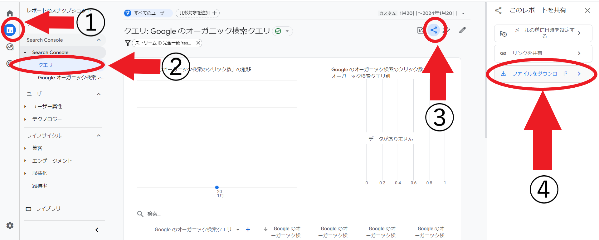
①から④までの手順でGoogleAnalyticsからデータをダウンロードできます.
import csv
import numpy as np
import japanize_matplotlib
import matplotlib.pyplot as plt

data = []
# GoogleAnalyticsからダウンロードしたデータのパスを入力してください
with open("data-export-3month.csv",encoding="utf-8") as f:
    reader = csv.reader(f)
    for row in reader:
        data.append(row)

# 不要な部分を取り除く
data = data[10:]

# 散布図
x = []
y = []
# 棒グラフ用
table = [[] for _ in range(100)]
for d in data:
    # 表示回数が100以上 掲載順位が10位以下
    if int(d[2]) >= 100 and float(d[4]) <= 11:
        # 散布図
        y.append(float(d[3])*100)
        x.append(float(d[4]))
        # 棒グラフ用
        ctr = float(d[3])
        rank = round(float(d[4]))
        table[rank].append(ctr)

fig = plt.figure(figsize=(8, 6))
plt.scatter(x,y)
# x軸のラベルのステップを設定
step = 1
x2 = np.arange(0, 11, 0.1)
plt.xticks(np.arange(min(x2), max(x2)+1, step))

# y軸の最小値を0に設定
plt.ylim(bottom=0)

# グラフにタイトルと軸ラベルを追加
plt.title('掲載順位とクリック率 (散布図)', fontsize=16)
plt.xlabel('掲載順位',fontsize=14)
plt.ylabel('クリック率(%)',fontsize=14)
plt.plot()

T = []
my_values = []
for i,t in enumerate(table):
    if 1 <= i <= 10:
        if t:
            my_values.append(round(10000*sum(t)/len(t))/100)
        else:
            my_values.append(0)

        T.append(len(t))

# サンプルデータの作成
categories = [f'{11-i}位' for i in range(1,11)]
my_values.reverse()

# 横棒グラフの作成
fig = plt.figure(figsize=(8, 6))
bars = plt.barh(categories, my_values)

plt.title('掲載順位とクリック率',fontsize=16)
plt.xlabel('クリック率(%) \n ※カッコ内はレコード数',fontsize=14)
plt.ylabel('掲載順位',fontsize=14)

# 各棒の横に数値を表示
for i,bar in enumerate(bars):
    yval = bar.get_y()+0.2
    plt.text(bar.get_x() + bar.get_width() + 5.2, yval, f"{my_values[i]}% ({T[9-i]})", ha='center', va='bottom')

plt.show()

categories = [f'{i}位' for i in range(1, 11)]
other_values = [1.42, 1.46, 1.71, 2.2, 2.98, 3.94, 5.56, 10.4, 14.25, 38.62]  # 他サイトのクリック率

# 横棒グラフの作成
fig, ax = plt.subplots(figsize=(10, 6))

# モバイルとデスクトップの棒グラフを横に並べて表示
bar_width = 0.35
other_bar_positions = range(len(categories))
my_bar_positions = [pos + bar_width for pos in other_bar_positions]

other_bars = ax.barh(other_bar_positions, other_values, bar_width, label='他サイト', alpha=0.7)
my_bars = ax.barh(my_bar_positions, my_values, bar_width, label='当サイト', alpha=0.7)

# タイトルとラベルの設定
plt.title('他サイトとの比較', fontsize=16)
plt.xlabel('クリック率(%)', fontsize=14)
plt.ylabel('掲載順位', fontsize=14)

# y軸の表示を"1位"から"10位"に変更
plt.yticks(other_bar_positions, categories[::-1])

# 各棒の上に数値を表示
i = 0
for bar, values in zip(other_bars, other_values):
    yval = bar.get_y() + bar.get_height() / 2
    plt.text(bar.get_width() + 0.2, yval, f"{values}%", va='center')
    i += 1

i = 0
for bar, values in zip(my_bars, my_values):
    yval = bar.get_y() + bar.get_height() / 2
    plt.text(bar.get_width() + 0.2, yval, f"{values}%", va='center')
    i += 1

# 凡例の表示
# 凡例の順番を変更して表示
handles, labels = ax.get_legend_handles_labels()
plt.legend(handles[::-1], labels[::-1])  # 凡例の順番を逆にする

# 最後に表示
plt.show()